A Case Study in Building a Marketing Agency Website
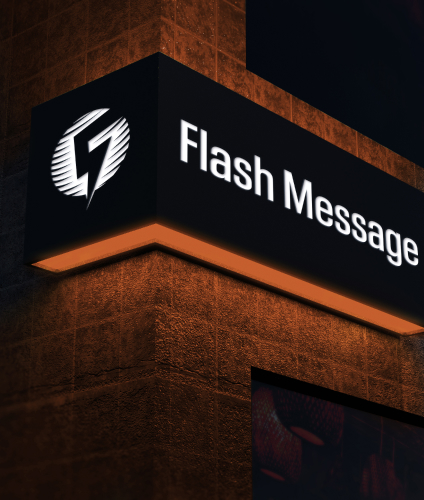
Flash Message
PROJECT
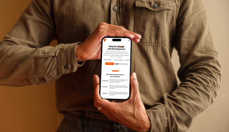
Website design And development
-
Published
24th June 2024
-
Country
Portugal
-
Website
Flash Message -
Timeline
3 Months
Project Overview
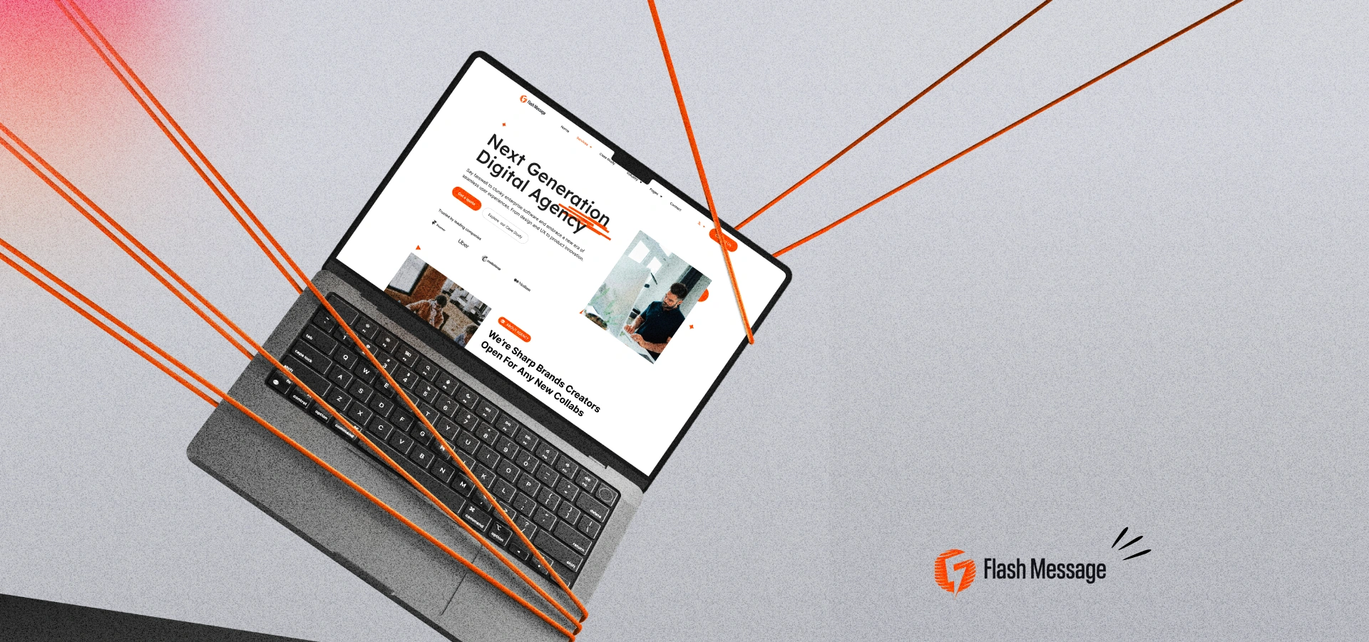
Flash Message, a powerhouse digital agency, was ready to take its brand online for the first time. They needed a website that would not only establish their presence but also capture the essence of their innovative spirit and attract potential clients. Future Innovation LTD was brought in to turn Flash Message's vision into reality.
Flash Message was full of great ideas and creativity, but they were missing a key piece: a website! They needed a place online to showcase their talents, tell their story, and most importantly, land new clients. That's where Future Innovation LTD came in! We wanted to create a website that would be:
- Their Brand New Online Home: This website would be Flash Message's main spot online, where everyone could learn about them and what they do.
- An Eye-Catching First Impression: We wanted the website to look amazing and grab attention, just like Flash Message grabs attention with their creative ideas.
- A Lead Magnet: This website wouldn't just be pretty, it would also be a lead magnet! We wanted to make it super easy for potential clients to connect with Flash Message.
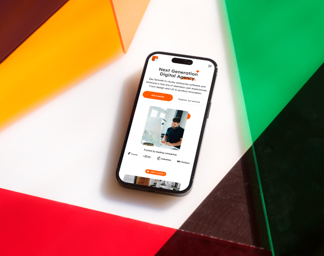
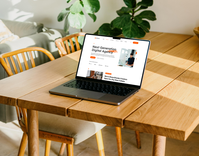
Problem
- No Digital Home: They lacked a website, making it hard for potential clients to find them online and learn about their services.
- Unclear Brand Identity: Without a website, Flash Message couldn't effectively showcase their unique style and innovative spirit.
Challanges
- Be Like Flash Message: The website had to reflect Flash Message's unique style and make it easy for visitors to find what they needed. Think clear menus, simple explanations, and a design that pops!
- Turn Visitors into Fans: The website had to be more than just a pretty face. It needed to convince potential clients to work with Flash Message. This meant clear calls to action, a user-friendly contact form, and content that highlights how awesome Flash Message is.
Our Solutions
- Understanding Flash Message: We talked to Flash Message to learn about their brand, who they want to work with, and what services they offer. This way, the website would be a perfect fit for them.
- Easy Navigation: We designed the website to be super easy to use, with clear menus that make finding information a breeze.
- Cool Content: We created content that explains what Flash Message does and how they can help clients achieve their goals. It's clear, concise, and makes you want to work with them!
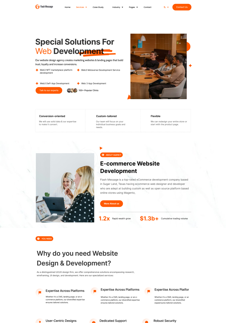
- Eye-Catching Design: We made the website look great with a modern design that reflects Flash Message's innovative spirit.
- Turning Visitors into Leads: We made it easy for potential clients to contact Flash Message by adding clear calls to action and a user-friendly contact form.
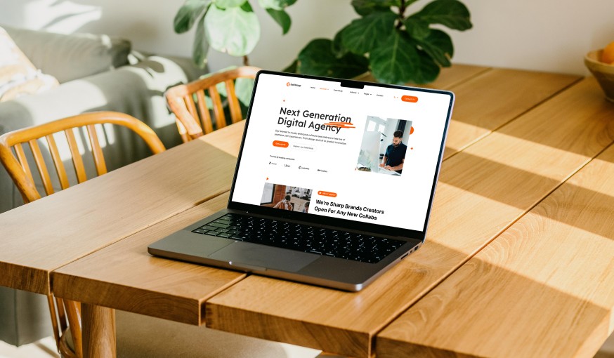
Workflow scenario
Here's a peek behind the curtain! This section delves into the collaborative process that brought Flash Message's website to life. We weren't just aiming for a good-looking website; we wanted one that delivered real results. To achieve this, we broke down the project into five key stages, creating a smooth workflow with clear communication and feedback every step of the way. Let's explore these stages and see how they transformed Flash Message's online presence!
Project
Timeline
Style guideline
A style guide is a set of standards and rules that govern the design and composition of documents, websites, and other media. It ensures consistency and coherence in visual and written communication, maintaining a unified brand identity across various channels.
Typography 01
Lexend Deca
| Name | Font size | Line Height |
|---|---|---|
Heading 2 |
48 px | 32 px |
Heading 3 |
32 px | 32 px |
|
Paragraph text |
16 px | 16 px |
|
----- |
-- px | -- px |
|
Medium Text Bold Medium Text Regular |
48 px | 32 px |
|
Normal Text Bold Normal Text Regular |
48 px | 32 px |
|
Small Text Bold Small Text Regular |
48 px | 32 px |
Color Palette
-
01
FF5900
-
02
000000
-
03
FFFFFF
-
04
4D4D4D
-
05
CACACA
colors are a powerful design tool that can influence perception, behavior, and brand identity, making them essential elements of any design project.
More Like This
Continue Reading


